
How to Draw 3D Charts with Matplotlib

In This Article, I’ll Show How to Draw Three-Dimensional Charts in Matplotlib. to Plot Charts in Matplotlib, You Need to Use a Zeppelin or Jupyter Notebook (Or...
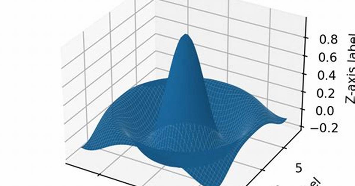
In this article, I’ll show how to draw three-dimensional charts in Matplotlib.
To plot charts in Matplotlib, you need to use a Zeppelin or Jupyter notebook (or another graphical environment). Your other option is to save your charts to a graphics file in order to display them later. This is particularly useful if you’re executing a long-running program that takes too many minutes or hours to run in an interactive notebook, such as a machine learning model.
(This article is part of our Data Visualization Guide. Use the right-hand menu to navigate.)
Introduction to 2D charts
I’ll start with a very easy explanation of the basic concepts. The flat surface of a chart is also known as the cartesian plane. You remember from high school that each point (x,y) is a point on this x-y flat surface.
The plot of a line with a 45-degree angle, for example, is f(x)=y=x. We usually write y=f(x) to mean x is a function of y.
Let’s plot y = sin(x) for the familiar curve that ranges between 1 and -1. Here we go.
We first fill an array of enough data points to make a smooth chart. In particular we set them 0.1 apart and range from -5 to 5:
x = np.arange(-5,5,0.1)
The rest of the code is simple. bo means blue circle.
import matplotlib.pyplot as plt
fig = plt.figure(figsize=(10,10))
x = np.arange(-5,5,0.1)
y = np.sin(x)
plt.plot(x,y,'bo')
Now, let’s add a third dimension to our first chart.
3D charting in Matplotlib
First, a caveat: People don’t use 3D charts often, mostly because readers have a difficult time understanding the charts. For example, it’s easy to read a 2D time-series chart, with time on the x-axis and y on the vertical axis. But if we add a third z-point, it’s floating in space, often resembling a blob and making the meaning hard to grasp.
Here, I will do something simple—place our flat sine curve in 2D space. This is technically called a hyperplane, since it has no dimension in the 3rd dimension.
In 3D space, each coordinate is given as (x,y,z). In calculus class, you’re used to seeing the coordinate system expressed like this:
The point z is a function of x and y. In charting, the principle is the same except these arrows (axes) are moved to the middle of the box, enclosing the chart space. The tick marks (e.g., -2, -1, 0, 1, 2) are drawn on the box that encloses those axes, which has not been moved to the origin, i.e. (x=0,y=0,z=0).
The direction of the z arrow can be up, out, or across. It’s just a matter of picking which orientation you find easiest to understand.
Sarah Jenkins is a veteran tech journalist with over 12 years of experience covering artificial intelligence, mobile innovations, and digital ethics. Her insights have appeared in leading technology publications worldwide.
