
Security Dashboard - Documentation for Truesight Vulnerability Management 3.1

The Security Dashboard Provides Visual Tools to Help Security and Operations Team Members Assess the Vulnerabilities Affecting Their Server Environment. to...
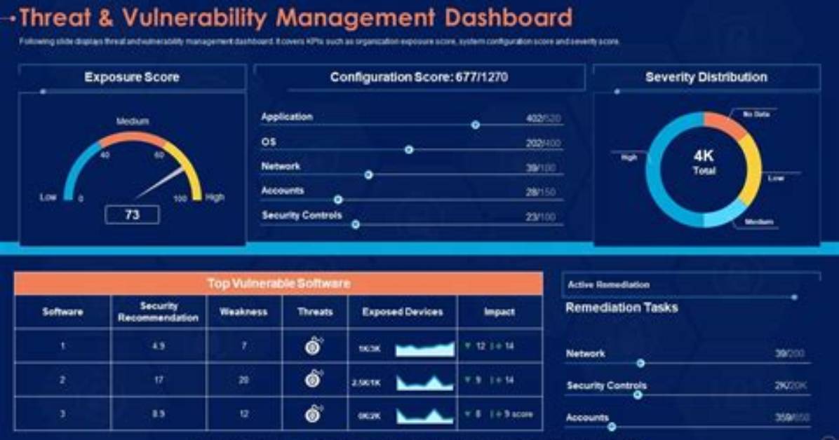
The Security Dashboard provides visual tools to help security and operations team members assess the vulnerabilities affecting their server environment.
To display the Security Dashboard, select TrueSight Vulnerability Management > Security Dashboard.
This topic includes the following sections:
Overview
The Security Dashboard offers a set of charts that give insight into the security status of a computing or network environment.
The Vulnerability Status bubble chart depicts vulnerabilities across a date range. The position, color, and size of bubbles indicate vulnerability severity, service level agreement (SLA) status, and number of endpoints affected. At a glance, you can identify situations on the bubble chart that may require immediate attention and prioritize remediation actions accordingly.
The Vulnerabilities per Stage bar chart shows the daily status of vulnerabilities across the same date range as the Vulnerability Status chart. Each bar in the chart represents vulnerabilities on a given day. Colors indicate the management status of each vulnerability, such as awaiting action or awaiting execution. Using this chart you can spot vulnerability management trends and project a date when all vulnerabilities should be closed.
The only action you can take from this dashboard is to export information. However, if you specify a set of filters on this page and then open the Operator Dashboard, it will automatically use the same set of filters.
Notes
For the Security Dashboard to show data, you must first:
- Import one or more scan files
- Map endpoints to assets included in scan files
- (Applicable only for version 3.0) Ensure that vulnerabilities have not been excluded from consideration.
- NEW IN 3.0.01 Ensure that exceptions have not been applied to vulnerabilities, which exclude them from various vulnerability counts depicted in the dashboard. For example, if for a vulnerability all assets have been considered for exclusion while adding or importing an exception, and so, the exception has been applied on all the assets that are affected by the vulnerability, that vulnerability is excluded from the counts (explained in the sections that follow). Also, if for an asset all vulnerabilities have been considered for exclusion while importing an exception, and so, the exception has been applied on the asset that is affected by all the vulnerabilities, that asset is excluded from the counts (explained in the sections that follow).
Must Read
Vulnerability Status chart
The Vulnerability Status bubble chart provides a snapshot showing how vulnerabilities affect your server or network environment.
The chart presents vulnerabilities across a date range (the X axis). The default date range is 90 days, but you can adjust the range. The Y axis measures severity; the most severe vulnerabilities (level 5) appear at the top of the axis.
The color of each bubble corresponds to an SLA status: green for within the SLA limits, yellow for approaching the SLA, or red for exceeding. (Both endpoint administrators and ordinary users can enter SLA standards for each severity level.)
The size of each bubble indicates how many endpoints are affected by these vulnerabilities; the bigger the circle, the more endpoints that are affected. Even though a single endpoint might have hundreds of severity 5 vulnerabilities, the size of the bubble remains constant if only that one endpoint is affected.
NEW IN 3.0.01 If you are using exceptions to exclude your assets and vulnerabilities from remediation, and if for a vulnerability all assets have been considered for exclusion while adding or importing an exception, and so, the exception has been applied on all the assets that are affected by the vulnerability, that vulnerability is excluded from this count. For example, if for a vulnerability, you have specified All endpoints, bubble size is reduced and SLA Breakdown chart is affected. If only selected vulnerabilities are considered, then the bubble size remains unaffected.
If for an asset all vulnerabilities have been considered for exclusion while importing an exception, and so, the exception has been applied on the asset that is affected by all the vulnerabilities, the asset count decreases by 1.
Using these visual cues, you can scan the chart to identify problems. For example, large red bubbles high on the Y axis might mean trouble. Red indicates the SLA has expired. Large bubbles mean more endpoints are affected. Higher on the Y axis means the vulnerability is more severe. When you identify a hot spot like this, you can hover the cursor over a bubble to get more information (as shown at right). Then you might want to instruct the operations team to take corrective actions. If necessary, you can export the contents of the dashboard.
Restricting vulnerabilities by stage
Headers on the Vulnerability Status chart show the average time needed for each stage of activity in the vulnerability management process.
You can limit the information displayed on the chart by clicking the headers that correspond to stages:
- Average Days Awaiting Attention—The average number of days before vulnerabilities are addressed as well as the average number of days for vulnerabilities that have never been addressed.
- Average Days Awaiting Approval—Vulnerabilities for which a remediation action has been created but still must be approved. This statistic is not provided for TrueSight Network Automation or SCCM.
- Average Days Awaiting Execution—Vulnerabilities for which a remediation action has been created and approved but still must be executed. This category also includes vulnerabilities that are currently being remediated.
- Average Days to Close—Vulnerabilities that have been closed. The color of bubbles indicates the SLA status of vulnerabilities when they were closed.
SLA Breakdown chart
The SLA Breakdown pie chart shows the total number of unique vulnerabilities for the selected stage and divides those vulnerabilities according to their SLA status. When you hover over any part of the chart, you see a breakdown of vulnerabilities by severity level.
Note that "within SLA" means vulnerabilities that have not exceeded the SLA and are not categorized as approaching the SLA.
NEW IN 3.0.01 If you are using exceptions to exclude your assets and vulnerabilities from remediation, and if for a vulnerability all assets have been considered for exclusion while adding or importing an exception, and so, the exception has been applied on all the assets that are affected by the vulnerability, that vulnerability is excluded from this count. For example, if for a vulnerability, you have specified All endpoints, then vulnerability count decreases by 1. If only selected assets or tags are considered, then the count remains unchanged.
David Miller brings 15 years of experience in global economics, personal finance strategy, and market dynamics. He specializes in turning complex economic trends into actionable insights for everyday readers.
