
Transform Only One Axis to Log10 Scale with Ggplot2

I Have the Following Problem: I Would Like to Visualize a Discrete and a Continuous Variable on a Boxplot in Which the Latter Has a Few Extreme High Values...
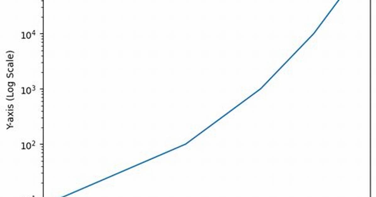
I have the following problem: I would like to visualize a discrete and a continuous variable on a boxplot in which the latter has a few extreme high values. This makes the boxplot meaningless (the points and even the "body" of the chart is too small), that is why I would like to show this on a log10 scale. I am aware that I could leave out the extreme values from the visualization, but I am not intended to.
Let's see a simple example with diamonds data:
m <- ggplot(diamonds, aes(y = price, x = color))
The problem is not serious here, but I hope you could imagine why I would like to see the values at a log10 scale. Let's try it:
m + geom_boxplot() + coord_trans(y = "log10")
As you can see the y axis is log10 scaled and looks fine but there is a problem with the x axis, which makes the plot very strange.
The problem do not occur with scale_log, but this is not an option for me, as I cannot use a custom formatter this way. E.g.:
m + geom_boxplot() + scale_y_log10()
My question: does anyone know a solution to plot the boxplot with log10 scale on y axis which labels could be freely formatted with a formatter function like in this thread?
Editing the question to help answerers based on answers and comments:
What I am really after: one log10 transformed axis (y) with not scientific labels. I would like to label it like dollar (formatter=dollar) or any custom format.
If I try @hadley's suggestion I get the following warnings:
> m + geom_boxplot() + scale_y_log10(formatter=dollar)
Warning messages:
1: In max(x) : no non-missing arguments to max; returning -Inf
2: In max(x) : no non-missing arguments to max; returning -Inf
3: In max(x) : no non-missing arguments to max; returning -Inf
With an unchanged y axis labels:
4 Answers
The simplest is to just give the 'trans' (formerly 'formatter') argument of either the scale_x_continuous or the scale_y_continuous the name of the desired log function:
library(ggplot2)  # which formerly required pkg:plyr
m + geom_boxplot() + scale_y_continuous(trans='log10')
EDIT: Or if you don't like that, then either of these appears to give different but useful results:
m <- ggplot(diamonds, aes(y = price, x = color), log="y")
m + geom_boxplot()
m <- ggplot(diamonds, aes(y = price, x = color), log10="y")
m + geom_boxplot()
EDIT2 & 3: Further experiments (after discarding the one that attempted successfully to put "$" signs in front of logged values):
# Need a function that accepts an x argument
# wrap desired formatting around numeric result
fmtExpLg10 <- function(x) paste(plyr::round_any(10^x/1000, 0.01) , "K $", sep="")

ggplot(diamonds, aes(color, log10(price))) +
  geom_boxplot() +
  scale_y_continuous("Price, log10-scaling", trans = fmtExpLg10)
Note added mid 2017 in comment about package syntax change:
scale_y_continuous(formatter = 'log10') is now scale_y_continuous(trans = 'log10') (ggplot2 v2.2.1)
I had a similar problem and this scale worked for me like a charm:
breaks = 10**(1:10)
scale_y_log10(breaks = breaks, labels = comma(breaks))
as you want the intermediate levels, too (10^3.5), you need to tweak the formatting:
breaks = 10**(1:10 * 0.5)
m <- ggplot(diamonds, aes(y = price, x = color)) + geom_boxplot()
m + scale_y_log10(breaks = breaks, labels = comma(breaks, digits = 1))
After executing::
Another solution using scale_y_log10 with trans_breaks, trans_format and annotation_logticks()
library(ggplot2)

m <- ggplot(diamonds, aes(y = price, x = color))

m + geom_boxplot() +
  scale_y_log10(
    breaks = scales::trans_breaks("log10", function(x) 10^x),
    labels = scales::trans_format("log10", scales::math_format(10^.x))
  ) +
  theme_bw() +
  annotation_logticks(sides = 'lr') +
  theme(panel.grid.minor = element_blank())
I think I got it at last by doing some manual transformations with the data before visualization:
d <- diamonds
# computing logarithm of prices
d$price <- log10(d$price)
And work out a formatter to later compute 'back' the logarithmic data:
formatBack <- function(x) 10^x
# or with special formatter (here: "dollar")
formatBack <- function(x) paste(round(10^x, 2), "$", sep=' ')
And draw the plot with given formatter:
m <- ggplot(d, aes(y = price, x = color))
m + geom_boxplot() + scale_y_continuous(formatter='formatBack')
Sorry to the community to bother you with a question I could have solved before! The funny part is: I was working hard to make this plot work a month ago but did not succeed. After asking here, I got it.
Anyway, thanks to @DWin for motivation!
David Miller brings 15 years of experience in global economics, personal finance strategy, and market dynamics. He specializes in turning complex economic trends into actionable insights for everyday readers.
