
What Is an Ogive in Statistics? Definitions, Examples and Graph

What Is an Ogive in Statistics? in Statistics, an Ogive, Also Known as a Cumulative Frequency Polygon, Refers to Two Different Things:1. a Hand-Drawn Graph of...
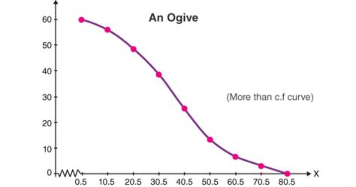
What is an Ogive in Statistics?
In statistics, an ogive, also known as a cumulative frequency polygon, refers to two different things:
1. A hand-drawn graph of a cumulative distribution function: This type of ogive is a freehand curve drawn to visually represent the cumulative distribution of a set of data. It shows the proportion of data points that are less than or equal to a given value.
2. An empirical cumulative distribution function: This type of ogive is a step-function graph that is constructed from the data itself. It shows the cumulative frequency of each class interval in a frequency table.
Both types of ogives are used to answer questions about the distribution of data. They can be used to:
- Estimate the percentage of data points that fall below a certain value.
- Compare the distributions of two or more sets of data.
- Identify outliers in a data set.
- Determine the median, quartiles, and other percentiles of a data set.
Here are some key points to remember about ogives:
- Ogive is a cumulative representation of frequency. It shows the running total of frequencies up to a certain point, unlike a simple frequency polygon which shows the individual frequencies.
- Ogive is made up of line segments connecting points representing class limits and their corresponding cumulative frequencies.
- There are two types of ogives: "more than" and "less than". A "more than" ogive shows the percentage of data points that are greater than a certain value, while a "less than" ogive shows the percentage of data points that are less than a certain value.
- Ogive can be used to estimate percentiles. The 50th percentile, or median, is the point where the "more than" and "less than" ogives intersect.
Must Read
Ogive Definition
An ogive, in statistical terms, refers to a graphical representation that displays the cumulative distribution of a dataset. It is often used to visualize the cumulative frequency distribution of a set of continuous data. The ogive is constructed by plotting points that represent the cumulative frequency at various intervals or class boundaries.
There are two types of ogives: less than type and more than type.
-
Less than type ogive: In this type of ogive, the cumulative frequencies are plotted against the upper class boundaries or midpoints of the class intervals. The points are connected with straight lines to form a curve.
-
More than type ogive: In this type of ogive, the cumulative frequencies are plotted against the lower class boundaries or midpoints of the class intervals. Again, the points are connected to form a curve.
Ogives are useful for understanding the distribution of data, especially when dealing with large datasets. They help in identifying patterns, trends, and percentiles within the data.
James Sterling reports on renewable energy developments, climate policy, ecological conservation, and green tech innovations around the globe.
