
What's the Difference Between Display: Inline-Flex and Display: Flex?

I Am Trying to Vertically Align Elements Within an Id Wrapper. I Gave the Property Display: Inline-Flex; to This Id as the Id Wrapper Is the Flex Container...
I am trying to vertically align elements within an ID wrapper. I gave the property display:inline-flex; to this ID as the ID wrapper is the flex container.
But there is no difference in presentation. I expected that everything in the wrapper ID would be displayed inline. Why isn't it?
#wrapper {
    display: inline-flex;
    /*no difference to display:flex; */
}
<body>
<div id="wrapper">
<header>header</header>
<nav>nav</nav>
<aside>aside</aside>
<main>main</main>
<footer>footer</footer>
</div>
</body>10 Answers
display: inline-flex does not make flex items display inline. It makes the flex container display inline. That is the only difference between display: inline-flex and display: flex. A similar comparison can be made between display: inline-block and display: block, and pretty much any other display type that has an inline counterpart.1
There is absolutely no difference in the effect on flex items; flex layout is identical whether the flex container is block-level or inline-level. In particular, the flex items themselves always behave like block-level boxes (although they do have some properties of inline-blocks). You cannot display flex items inline; otherwise you don't actually have a flex layout.
It is not clear what exactly you mean by "vertically align" or why exactly you want to display the contents inline, but I suspect that flexbox is not the right tool for whatever you are trying to accomplish. Chances are what you're looking for is just plain old inline layout (display: inline and/or display: inline-block), for which flexbox is not a replacement; flexbox is not the universal layout solution that everyone claims it is (I'm stating this because the misconception is probably why you're considering flexbox in the first place).
1 The differences between block layout and inline layout are outside the scope of this question, but the one that stands out the most is auto width: block-level boxes stretch horizontally to fill their containing block, whereas inline-level boxes shrink to fit their contents. In fact, it is for this reason alone you will almost never use display: inline-flex unless you have a very good reason to display your flex container inline.
OK, I know at first might be a bit confusing, but display is talking about the parent element, so means when we say: display: flex;, it's about the element and when we say display:inline-flex;, is also making the element itself inline...
It's like make a div inline or block, run the snippet below and you can see how display flex breaks down to next line:
.inline-flex {
  display: inline-flex;
}

.flex {
  display: flex;
}

p {
  color: red;
}
<body>
<p>Display Inline Flex</p>
<div class="inline-flex">
<header>header</header>
<nav>nav</nav>
<aside>aside</aside>
<main>main</main>
<footer>footer</footer>
</div>
<div class="inline-flex">
<header>header</header>
<nav>nav</nav>
<aside>aside</aside>
<main>main</main>
<footer>footer</footer>
</div>
<p>Display Flex</p>
<div class="flex">
<header>header</header>
<nav>nav</nav>
<aside>aside</aside>
<main>main</main>
<footer>footer</footer>
</div>
<div class="flex">
<header>header</header>
<nav>nav</nav>
<aside>aside</aside>
<main>main</main>
<footer>footer</footer>
</div>
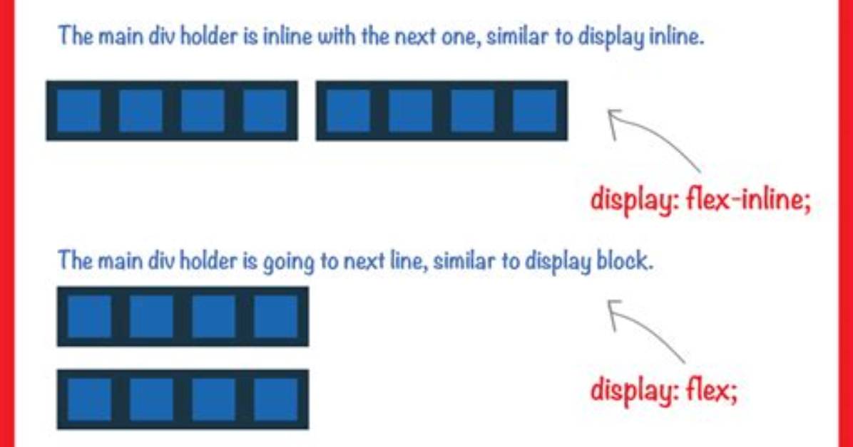
</body>Also quickly create the image below to show the difference at a glance:
flex and inline-flex both apply flex layout to children of the container. Container with display:flex behaves like a block-level element itself, while display:inline-flex makes the container behaves like an inline element.
Using two-value display syntax instead, for clarity
The display CSS property in fact sets two things at once: the outer display type, and the inner display type. The outer display type affects how the element (which acts as a container) is displayed in its context. The inner display type affects how the children of the element (or the children of the container) are laid out.
If you use the two-value display syntax, which is only supported in some browsers like Firefox, the difference between the two is much more obvious:
display: blockis equivalent todisplay: block flowdisplay: inlineis equivalent todisplay: inline flowdisplay: flexis equivalent todisplay: block flexdisplay: inline-flexis equivalent todisplay: inline flexdisplay: gridis equivalent todisplay: block griddisplay: inline-gridis equivalent todisplay: inline grid
Must Read
Outer display type: block or inline:
An element with the outer display type of block will take up the whole width available to it, like <div> does. An element with the outer display type of inline will only take up the width that it needs, with wrapping, like <span> does.
Robert Thorne covers electric vehicle innovations, autonomous driving systems, global mobility trends, and automotive engineering developments.
