
What Is the Rule for Frequency Polygon?

The Rule for Creating a Frequency Polygon Is as Follows: Collect the Data: Gather the Dataset for Which You Want to Create a Frequency Polygon. This Data...
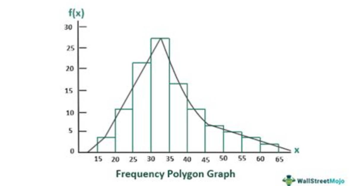
The rule for creating a frequency polygon is as follows:
- Collect the data: Gather the dataset for which you want to create a frequency polygon. This data should consist of values and their corresponding frequencies. The values can be numerical or categorical.
- Arrange the data: Arrange the data in ascending order if the values are numerical. If the values are categorical, arrange them in any logical order.
- Determine class intervals: For numerical data, divide the range of values into equal-sized intervals or classes. The number of intervals depends on the size of the dataset and the desired level of detail. Each class interval should be mutually exclusive and collectively exhaustive.
- Count frequencies: Count the number of occurrences or frequencies of values falling within each class interval.
- Plot the points: On a graph paper or a coordinate plane, plot the midpoints of each class interval on the x-axis. The midpoints are calculated by adding the lower and upper limits of each interval and dividing the sum by 2. The frequencies are plotted on the y-axis.
- Connect the points: Connect the plotted points consecutively using line segments. The line segments should start from the first midpoint and end at the last midpoint, creating a closed figure.
- Interpret the graph: Analyze the frequency polygon to understand the distribution of the data. Look for patterns, peaks, gaps, and trends in the graph. It can provide insights into the central tendency, variability, and shape of the dataset.
The frequency polygon is a graphical representation that displays the frequencies of different values or intervals in a dataset. It is similar to a histogram but uses line segments instead of bars. The frequency polygon provides a visual summary of the data distribution and is useful for comparing multiple datasets or identifying trends and outliers.
What is the Formula for the Frequency Polygon?
The frequency polygon is a graphical representation of a frequency distribution. It is created by connecting the midpoints of the upper side of each class interval in a histogram or frequency table. The formula for calculating the midpoints is as follows:
- Midpoint = (Upper Class Limit + Lower Class Limit) / 2
Once you have the midpoints, you can plot them on the x-axis of a graph. The y-axis represents the frequencies or counts associated with each class interval. To create the frequency polygon, you connect the points on the graph using line segments.
Here's a step-by-step process to create a frequency polygon:
- Collect data and organize it into a frequency distribution table or histogram.
- Calculate the midpoint of each class interval using the formula mentioned above.
- Plot the midpoints on the x-axis of the graph.
- Determine the frequency or count associated with each class interval.
- Plot the frequencies on the y-axis.
- Connect the plotted points with line segments to create the frequency polygon.
- Remember, the frequency polygon helps visualize the distribution of data and is particularly useful for displaying grouped data.
Must Read
What are the Properties of Frequency Polygons?
Frequency polygons are graphical representations of data that display the distribution of a dataset. They are constructed by connecting the midpoints of the tops of each bar in a histogram, using line segments. Frequency polygons have several properties:
- Display of Frequency Distribution: Frequency polygons provide a visual representation of the frequency distribution of a dataset. They show how the values are distributed across different intervals or classes.
- Line Graph Format: Frequency polygons are presented as line graphs. The x-axis represents the values or intervals, while the y-axis represents the frequency or relative frequency of each interval.
- Smooth Line: The line segments connecting the midpoints of the tops of each bar in the histogram are usually drawn smoothly, resulting in a continuous line. This line helps to visualize the pattern and trends in the data distribution.
- Central Tendency: Frequency polygons can indicate the central tendency of the data. For example, if the line is symmetrically distributed around a peak, it suggests that the data has a central tendency.
- Shape of Distribution: The shape of the frequency polygon provides insights into the distribution of the data. It can be symmetrical (bell-shaped), skewed to the right or left, or have other patterns that indicate the distribution's characteristics.
- Area Interpretation: The area under the frequency polygon represents the total frequency or relative frequency of the dataset. By calculating the area, you can determine the proportion of data falling within a certain range or interval.
- Comparison: Frequency polygons allow for easy comparison between different datasets. By plotting multiple frequency polygons on the same graph, you can observe similarities or differences in the distribution of the datasets.
- Data Extremes: Frequency polygons can highlight extreme values in the dataset. Peaks or high points on the graph indicate values with higher frequencies, while valleys or low points represent values with lower frequencies.
- Cumulative Frequency: Frequency polygons can also be used to represent cumulative frequency. By plotting the cumulative frequency against the upper or lower boundaries of each interval, a cumulative frequency polygon can be constructed.
These properties make frequency polygons a useful tool for analyzing and interpreting data distributions. They provide a clear visual representation that helps in understanding the characteristics and patterns of a dataset.
Sarah Jenkins is a veteran tech journalist with over 12 years of experience covering artificial intelligence, mobile innovations, and digital ethics. Her insights have appeared in leading technology publications worldwide.
